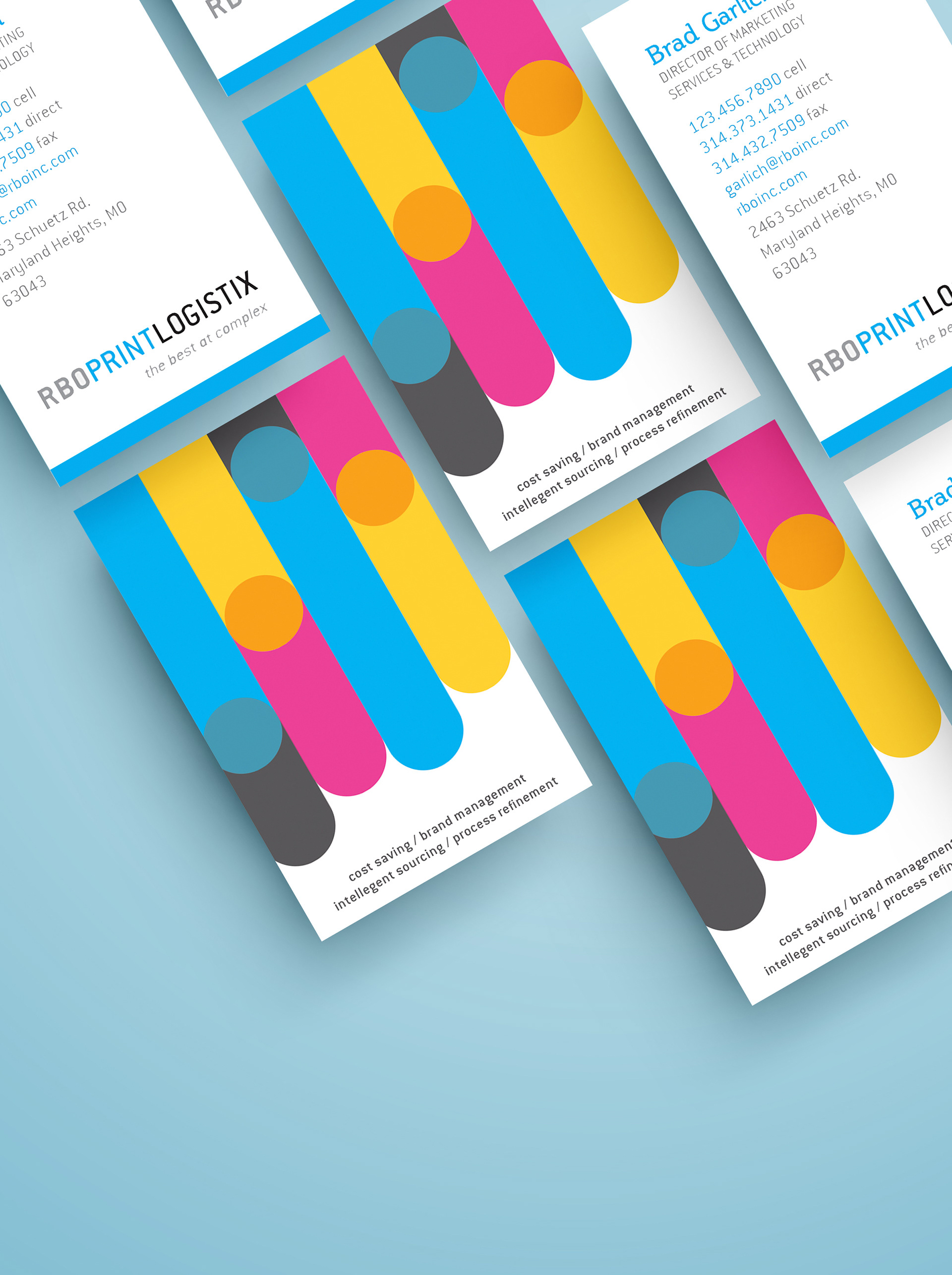
Redesigned business cards built on clean typography and a CMYK-inspired color treatment that references RBO's print heritage without being heavy-handed about it. Print-ready precision was non-negotiable given the company's business.
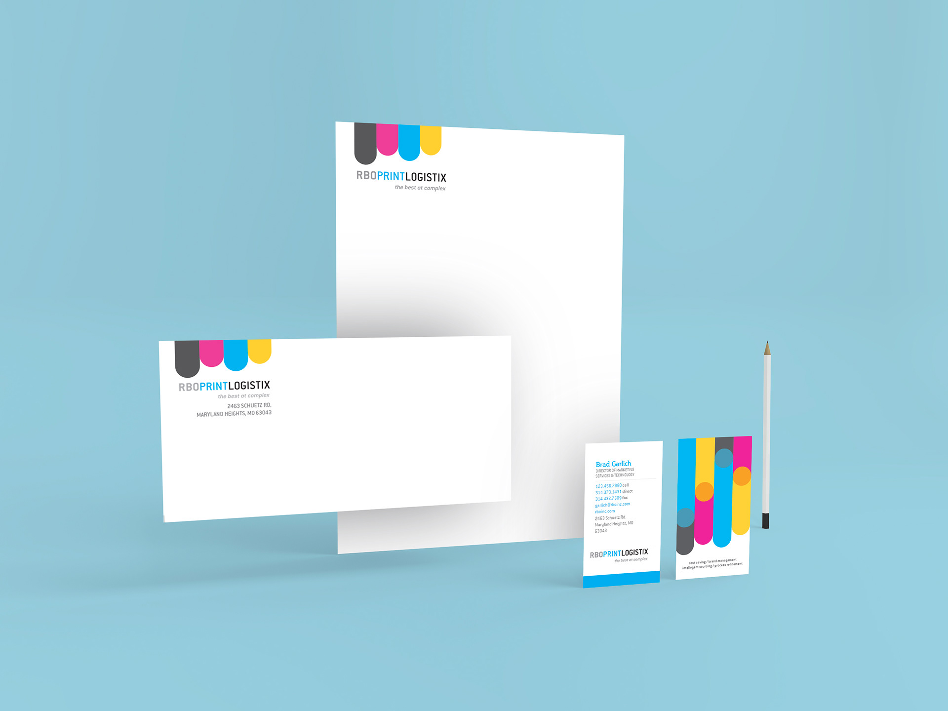
The complete stationery system laid out together — business cards, letterhead, and envelopes as a unified set. A company that deploys other brands at scale needed their own materials to actually look the part.
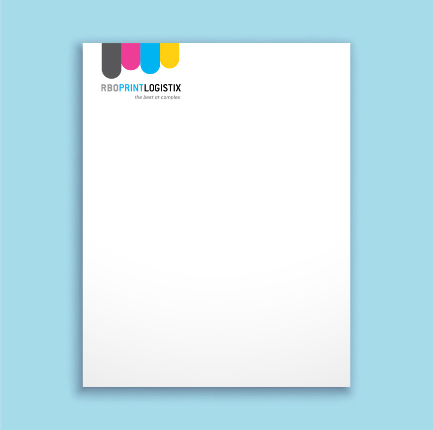
Redesigned letterhead built for professional business communications. Clean hierarchy, balanced spacing, and subtle CMYK elements carried throughout to keep the system consistent from top to bottom.