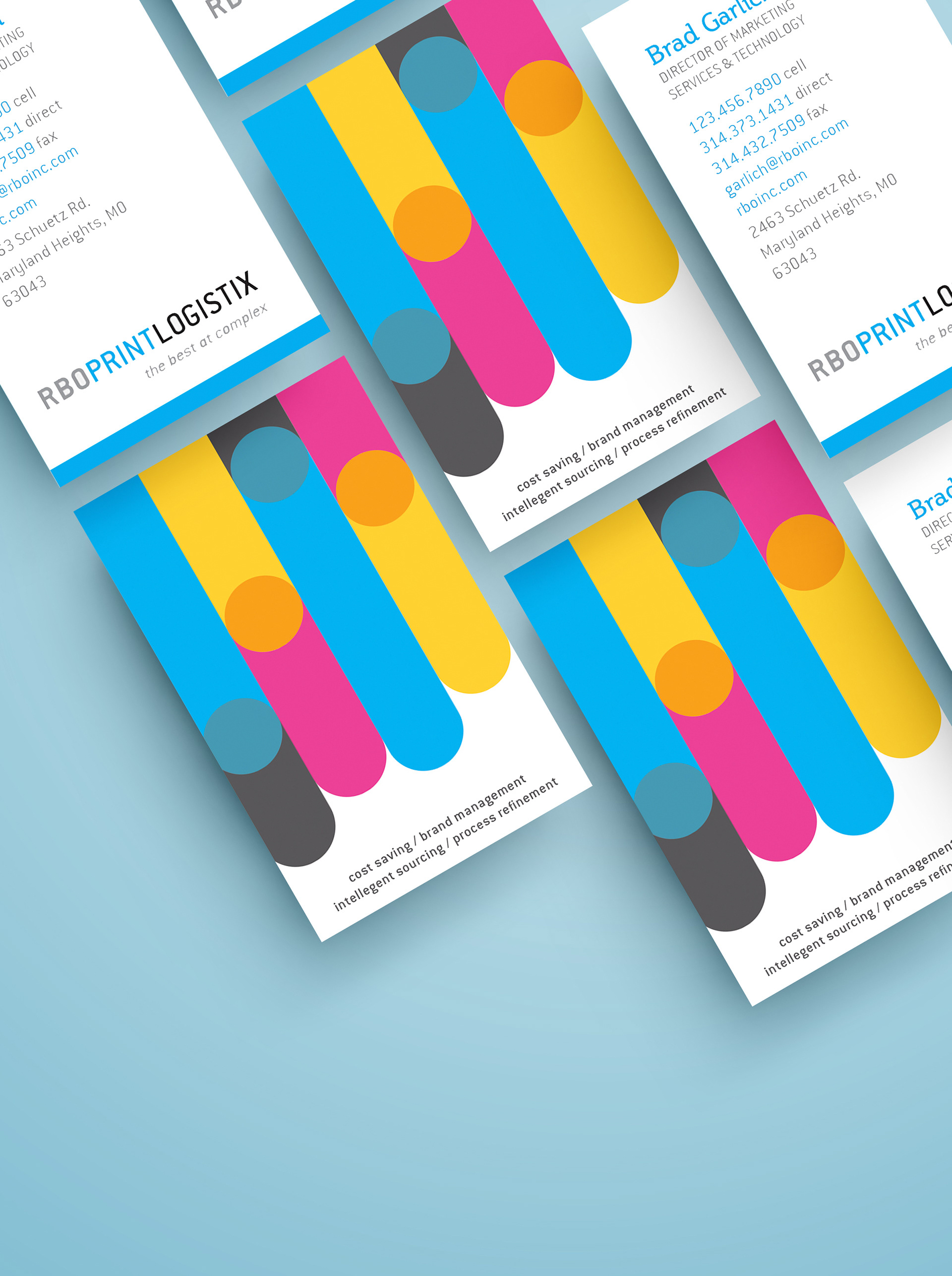
Business card design created as part of the RBO PrintLogistix stationery system, focused on balancing clean typography, brand consistency, and professional presentation. The design incorporated CMYK-inspired color treatments as a visual nod to the print industry while emphasizing hierarchy, print-ready precision, and cohesive branding across physical touchpoints.
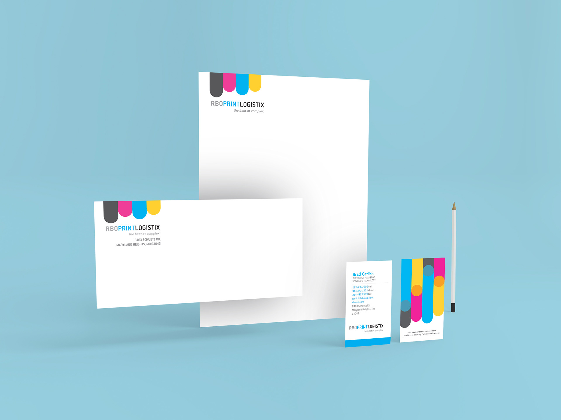
Complete stationery system showcasing the cohesive application of the RBO PrintLogistix brand identity across business cards, letterheads, and envelopes. The collection emphasized clean layout structure, print-focused design thinking, and consistent visual branding while incorporating CMYK-inspired elements that reflected the company’s roots in print production.
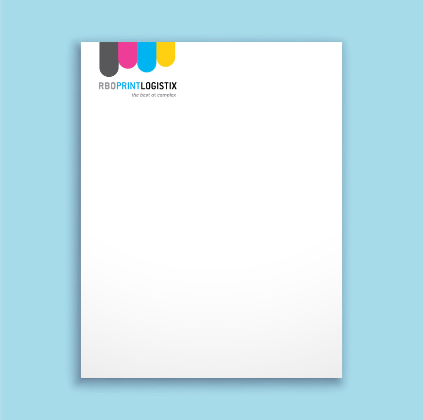
Letterhead design created to extend the RBO PrintLogistix brand identity into professional business communications. The layout focused on clean hierarchy, balanced spacing, and print-ready structure while incorporating subtle CMYK-inspired visual elements that reflected the company’s expertise in print production and design.